
Sig-Prep!
A comic book idea that grew from making fun of fraternities in college. Sig-Prep tells the story of being a pledge in the most elite social club that Greek life has to offer. I had no intention of doing interiors, just to learn from some comic artists
For the first two issues, I was inspired by the work of David Fincher. I really love his portraits and his hard black inks.
The Good: I like the pose. I think I the anatomy is pretty good and I like the colors I chose. I like the title. I really like puns.
The Bad: Though I like the colors, I don’t like the execution of the markers. If I completed it in adobe illustrator, I think it would have been cleaner.
The arm is funky, The delt is oddly shaped.


I think Issue 2 is the best of the 3. I found an old batman issue Detective Comics #620. I didn’t understand how that background works though.
The Good: I felt good about the hard blacks on the arm and on the Adam’s apple
The Bad: I did not add any shadows to the shirt. Even just a darker color would go a long way.
Issue 4 is is directly inspired by the Uncanny X-Men Vol. 6: Storyville. and the cover by Chris Bachalo.
This was my first had to focus on figure drawing.
The Good: Its a tough angle and I feel pretty good about it for the most part. I like the kid smoking; I think that adds to the misery of the cover. I also like the title.
The Bad: Some of the shadows need work. And I’m still struggling to add folds to the clothing.

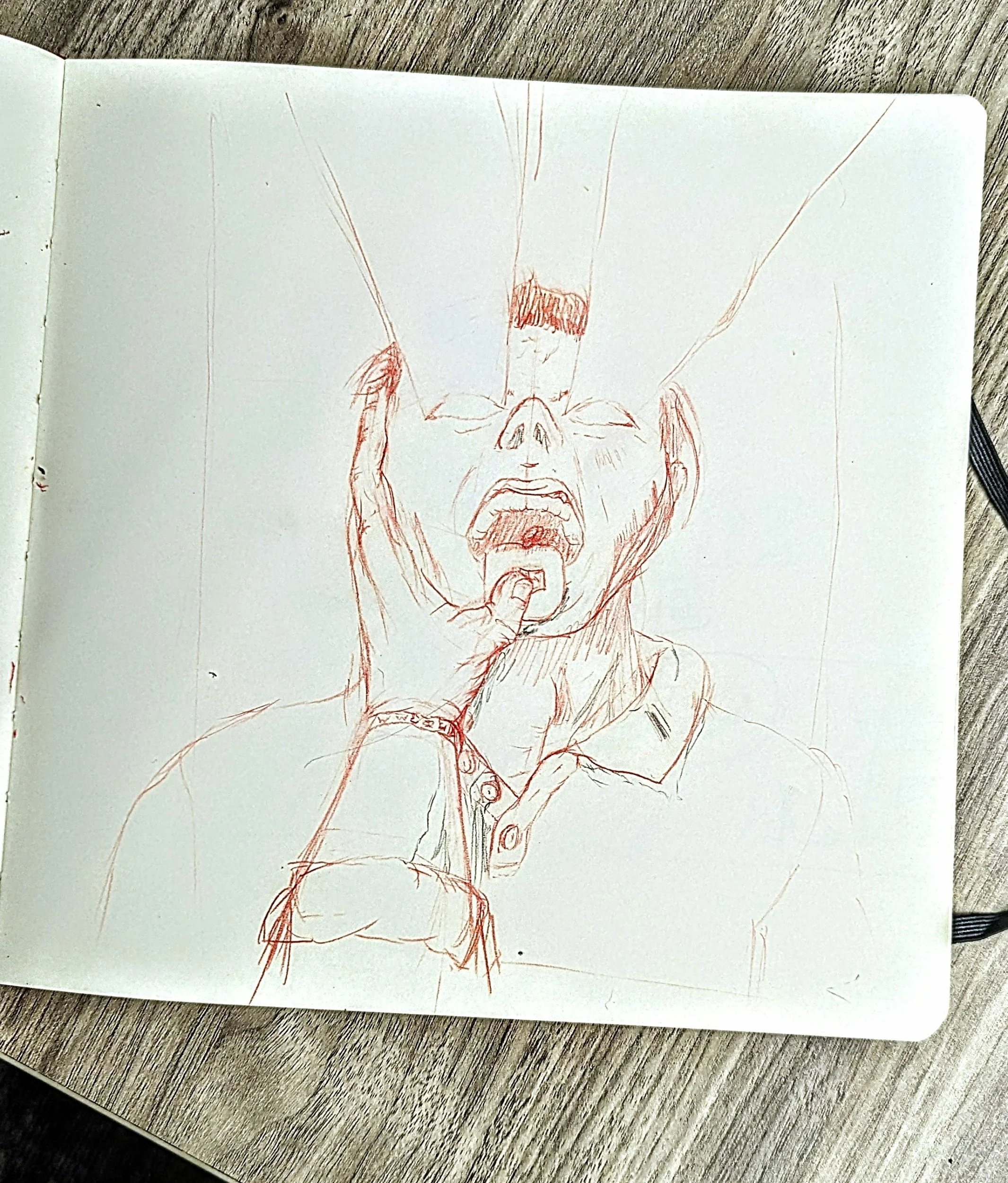
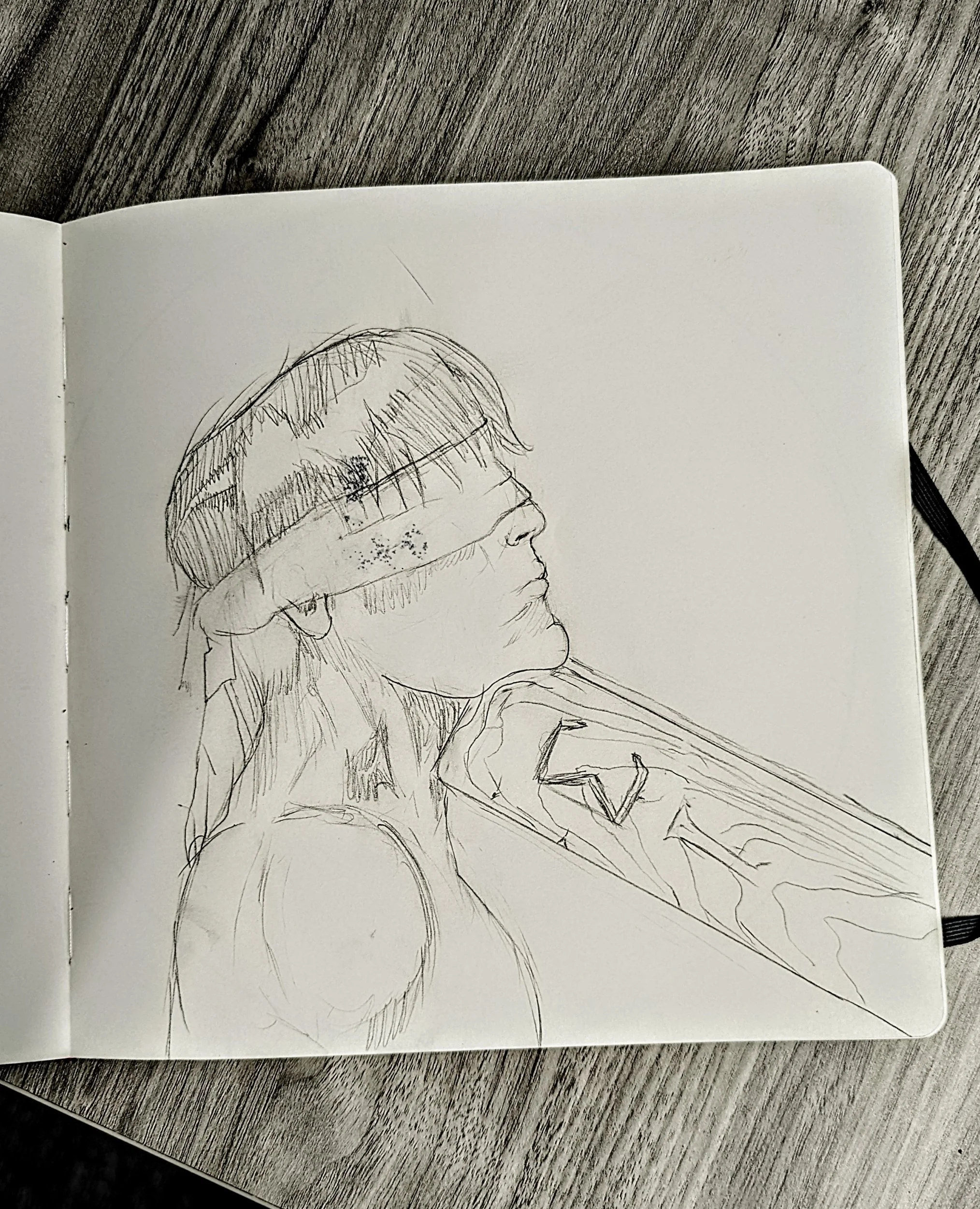
Some Prepwork sketches

Unfinished Issue 3. I might come back to it. I didn’t like the hair and lighting I chose
