
Shiny Clothing Study
I want to understand drawing clothes like satin, latex, and leather. I’ve seen artwork of Psylocke by Jim Lee and Black Cat by Patrick Gleason to try to understand the color theory behind these fabrics.
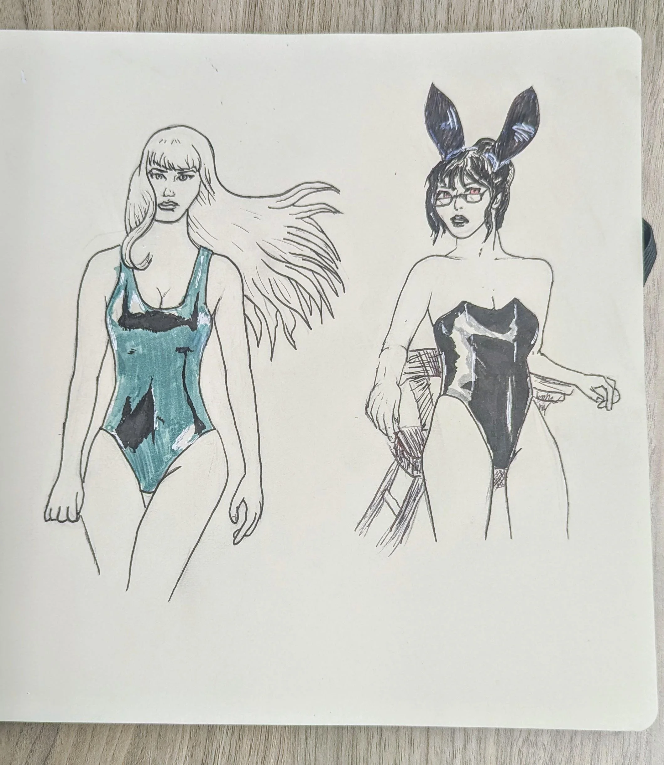
I was drawn to the idea of a black tone, a midtone and white to varying degrees of success.
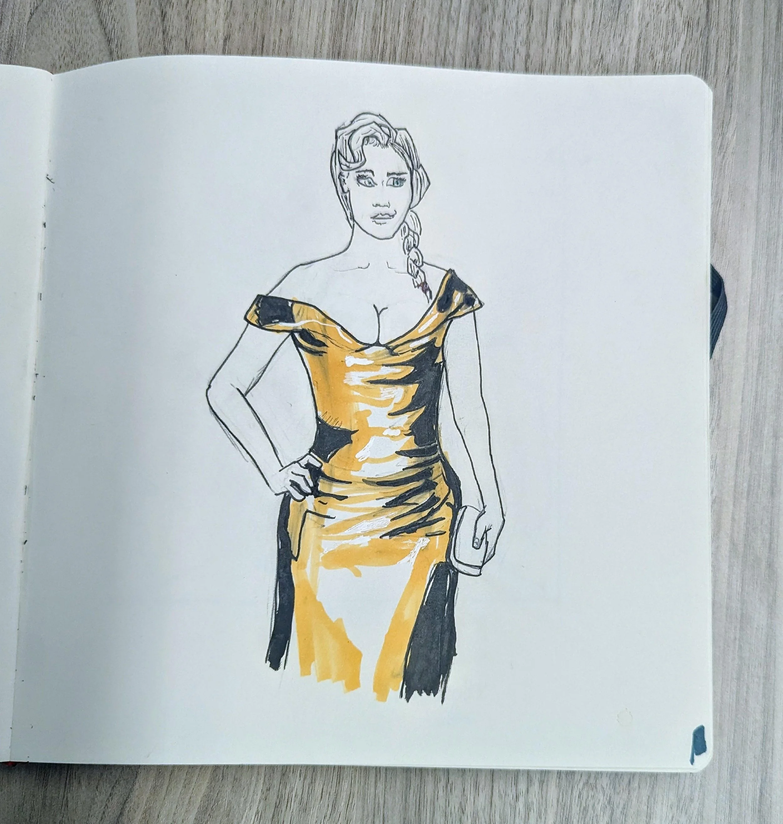
For my next study, I was a bit more ambitious and attempted to understand the folds of a satin dress, again with three colors.
A background might help this but I think lost the light a bit.
I’ve been reading through old issues of Heavy Metal and have always been intrigued by the gut-punch nature of their covers. October 1985 and June 2014 are personal favorites.
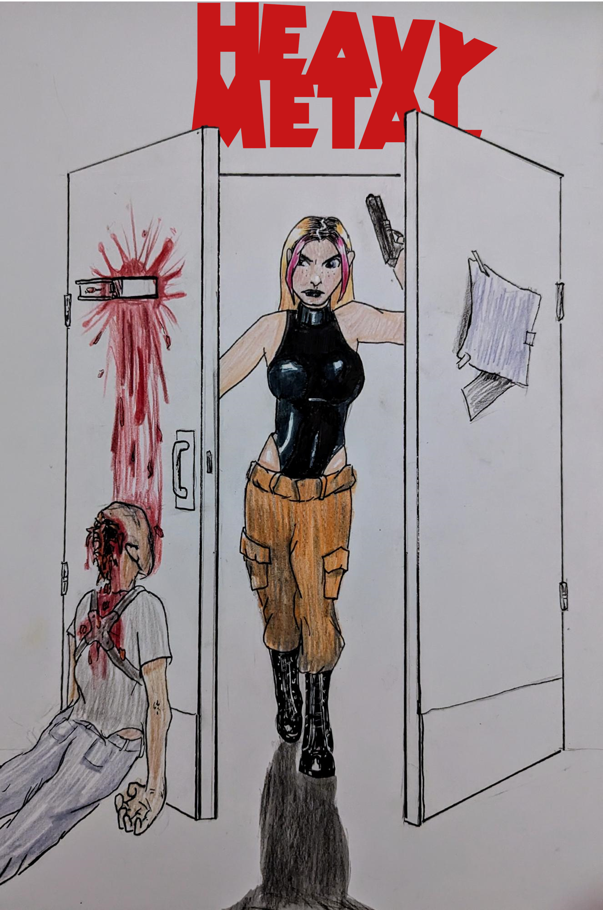
Again, I’m bad at backgrounds. I was hoping the negative space could add artistic license to it.
(logo was edited in. I was burnt out on logos after Sig-Prep)
The Good: My goal was to get the the boots and the tank top lighting correct and i really like how the boots came out.
I like the pose as well.
The Bad: I need stronger line weights.
I think I would like to try cel shading skin tones as well.