
Skin Tone Study
Moving along, I wanted to break away from ink studies and use some of the other art supplies I had in my drawer.
I’ve been really captivated by portraits on toned papers. I had some grey paper and so my plan was to color some figure drawings with colored pencils.
First Mistake: grey paper is not the right medium for this. I realized too late there is a reason why all my reference photos were on tan paper. It creates the skin’s midtone. So I’m already starting behind the eight ball.
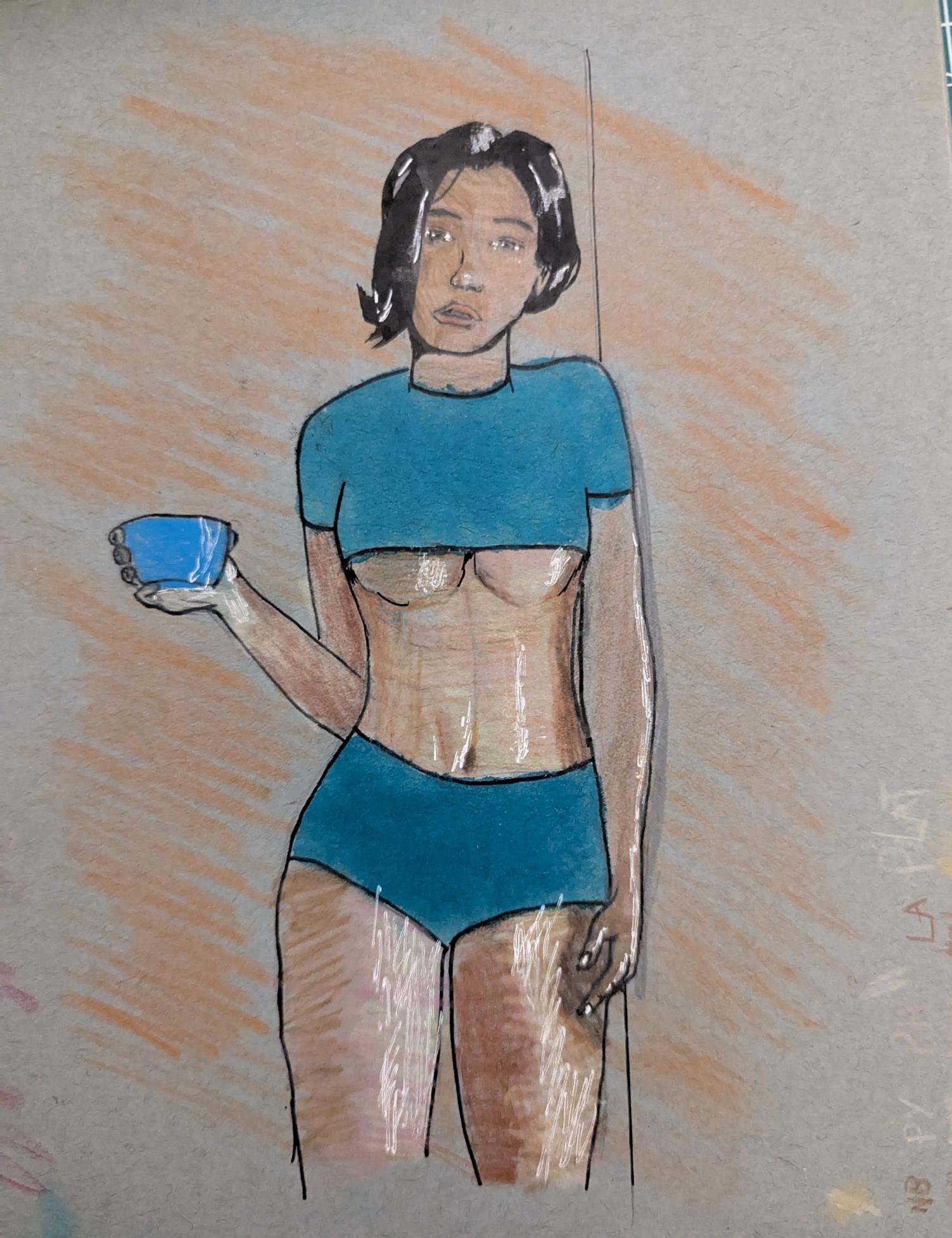
First Drawing: I really just wanted to get the pencils on paper and see how much much it took to color in the grey. It was a lot. it took a lot of passes to just to get a base layer.
On this, I think I used too many colors. The reference photo i used had yellow tones in her skin but I couldn’t get it to match like i wanted it to.
Overall, too many pencils. After a while, the layering stopped working.

I think overall this is much better. I think I found the muscle group shadows to work better on this one and i used less colors. I also swapped out a white gel pen with a white colored pencil which looks better than the one above.
Going back to Gavin Guidry’s work, the proportions on his faces are amazing. On mine, I think the colors really amplifies my errors.
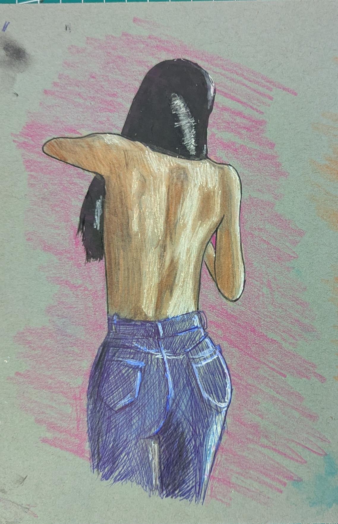
I think this is my best of the three. I think my reference photo had pretty strong contrasting shadows and I think I was able to blend them successfully. I used a combination of white gel pen and white colored pencils.
Blue Ball point was a fun way to draw the jeans.
Overall, this was a fun change of pace for me. The process from thinking I ruined the work, to salvaging it, was fun to learn.
I think i need to get better at faces. I might do the 100 Faces challenge to really lock in.